How to Build Stunning Data Visualizations in Python with Matplotlib and Plotly

Introduction
Visualization is the skill that gives this data a voice, transforming numbers into clear, compelling stories that drive decisions. In this article, I will walk you through how to build a stunning visualization in python with Matplotlib and Plotly.
This guide is your first step toward mastering them. We’ll take the famous Titanic dataset and walk you through creating a series of insightful visualizations, from foundational charts with Matplotlib to stunning, interactive plots with Plotly.
Before we write any code, let’s understand why we’re looking at these two specific libraries.
- Matplotlib: The Foundation. Think of Matplotlib as the bedrock of Python visualization. It gives you complete, granular control over every element of your plot, from axes and labels to colors and styles. It’s perfect for creating high-quality, static images for reports and presentations.
- Plotly: The Interactive Powerhouse. Plotly takes visualization to the next level by making it easy to create modern, interactive, web-ready plots. With just a few lines of code, you can build charts that allow users to hover for details, zoom in on points of interest, and filter data on the fly.
Let’s get your environment set up with all the necessary libraries for this project.
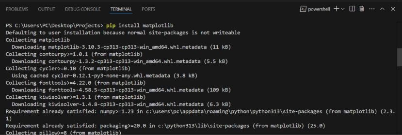
1. Install the Libraries
Open your terminal or command prompt and run the following command to install everything you’ll need. We’re including Seaborn, a popular library built on top of Matplotlib that simplifies creating common statistical plots.
<code>pip install numpy pandas matplotlib seaborn plotly jupyterlab</code>
The Role of Each Library
Let’s breakdown what each of these libraries does:
| Library | Role in This Project |
| NumPy | The fundamental package for numerical computing in Python. |
| Pandas | Used for data loading, manipulation, and cleaning. |
| Matplotlib | The core library for creating our foundational, static plots. |
| Seaborn | Helps us create more attractive statistical plots with less code. |
| Plotly | Our tool for building powerful, interactive visualizations. |
| JupyterLab | The interactive environment where we’ll write and run our code. |
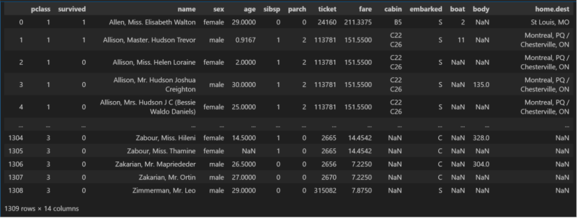
Data Ingestion and Inspection
For this tutorial, we’ll use the classic Titanic dataset. Instead of downloading a separate file, we can load it directly from the Seaborn library, which ensures our project is easily reproducible.
Create a new Jupyter Notebook and add the following code to the first cell to import our libraries and load the data.
# Import necessary libraries
import numpy as np
import pandas as pd
import matplotlib.pyplot as plt
import seaborn as sns
import plotly.express as px
# Load the Titanic dataset
from Seaborn titanic_df = sns.load_dataset('titanic')
# Display the first 5 rows to inspect the data
titanic_df.head()
Importing the Libraries
The first part of the code uses import command to bring in our python libraries so we can use their features.
- import pandas as pd: This brings in Pandas, which is like a powerful spreadsheet program for Python. We use it to organize and work with our data in a table called a DataFrame. We give it the nickname pd.
- import seaborn as sns and import matplotlib.pyplot as plt: These are our visualization libraries Matplotlib (plt) is the main engine for creating charts, and Seaborn (sns) works with it to make creating common statistical plots much easier and prettier.
- import plotly.express as px: This is our advanced library for making interactive charts that you can hover over and zoom into.
- import numpy as np: This brings in NumPy, a library for performing fast and efficient array-based computations.
Loading and Viewing the Data
The second part of the code gets our data ready.
- titanic_df = sns.load_dataset(‘titanic’): This line tells Seaborn (sns) to fetch its built-in ‘titanic’ dataset and load it into a Pandas table (a DataFrame), which we name titanic_df. This saves us from having to download any files manually.
- titanic_df.head(): This method simply shows us the first five rows of our titanic_df dataset, giving us a quick peek to make sure the data loaded correctly and to see what it looks like.
Weldone ✅ you have done amazing job. Now next, let’s dive deep into building amazing visuals using matplotlib.
Creating Visualizations with Matplotlib
Now that our data is ready, let’s create our first set of static visualizations. We will use Matplotlib (often paired with Seaborn for simplicity) to build foundational charts that are perfect for reports and presentations.
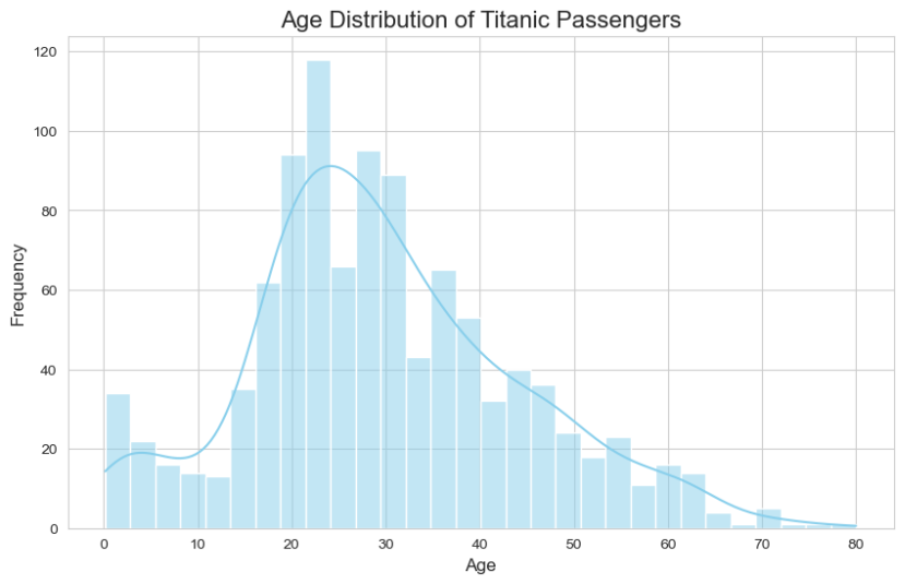
Histogram: Visualizing Age Distribution
A histogram is the perfect tool for understanding the distribution of a single numerical variable. It groups numbers into “bins” (ranges) and shows how many data points fall into each bin. Let’s use it to see the age distribution of the Titanic passengers.
# We drop missing values to avoid errors
age_data = titanic_df['age'].dropna()
# Set the style for the plots
sns.set_style("whitegrid")
# Create the plot figure
plt.figure(figsize=(10, 6))
# Create the histogram
sns.histplot(age_data, kde=True, bins=30, color='skyblue')
#Add titles and labels for clarity
plt.title('Age Distribution of Titanic Passengers', fontsize=16)
plt.xlabel('Age', fontsize=12)
plt.ylabel('Frequency', fontsize=12)
# Show the plot
plt.show()
Code Explanation
age_data = titanic_df[‘age’].dropna(): We select the ‘age’ column and use .dropna() to remove any rows with missing age values.
sns.set_style(“whitegrid”): We use Seaborn to set a clean, professional-looking style for our Matplotlib plots.
plt.figure(figsize=(10, 6)): This creates a blank canvas (a “figure”) for our plot, specifying its size in inches.
sns.histplot(…): This is a Seaborn function that simplifies creating a Matplotlib histogram.
kde=True: This adds a line (Kernel Density Estimate) that smoothly estimates the distribution.
bins=30: We specify that the ages should be grouped into 30 different bins.
plt.title(…), plt.xlabel(…), plt.ylabel(…): These functions add a title and labels to the x and y axes, which is crucial for making your chart understandable.
plt.show(): This command displays the final plot.
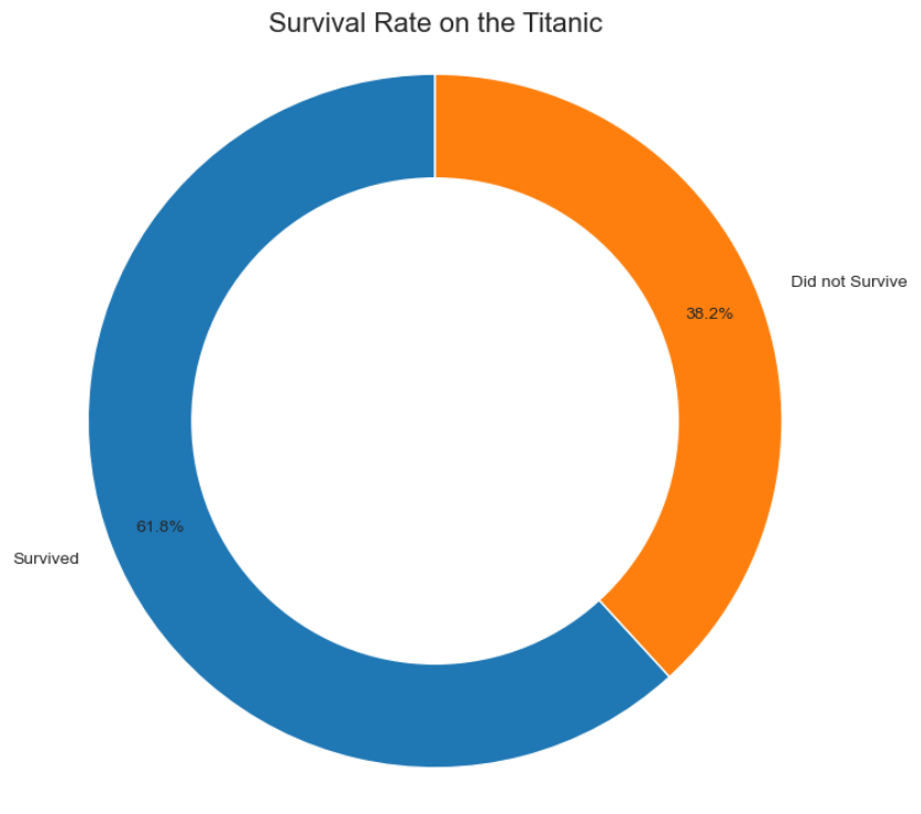
Donut Chart: Showing Survival Proportions
A donut chart is a variation of a pie chart used to show how different categories make up a whole. Let’s use one to visualize the proportion of passengers who survived versus those who did not.
survivor_counts = titanic_df['survived'].value_counts()
labels = ['Survived', 'Did not Survive']
#Create the plot figure
plt.figure(figsize=(8, 8))
#Create the pie chart
plt.pie(survivor_counts, labels=labels, autopct='%1.1f%%', startangle=90, pctdistance=0.85)
#Draw a white circle in the center to make it a donut chart
centre_circle = plt.Circle((0,0), 0.70, fc='white')
fig = plt.gcf()
fig.gca().add_artist(centre_circle)
#Add a title
plt.title('Survival Rate on the Titanic', fontsize=16)
#Ensure the plot is a circle
plt.axis('equal')
#Show the plot
plt.show()
Code Explanation
- titanic_df[‘survived’].value_counts(): We first count the occurrences of each value (0 for no, 1 for yes) in the ‘survived’ column.
- plt.pie(…): This function creates the base pie chart.
- survival_counts: The data we’re plotting.
- labels: The names for each slice.
- autopct=’%1.1f%%’: This formats the text on the slices to show the percentage with one decimal place.
- plt.Circle(…): This is the trick to a donut chart. We create a white circle shape.
- fig.gca().add_artist(centre_circle): We get the current axes (gca) and add the white circle right in the middle, creating the “hole”.
- plt.axis(‘equal’): This ensures that our donut chart is a perfect circle and not an oval.
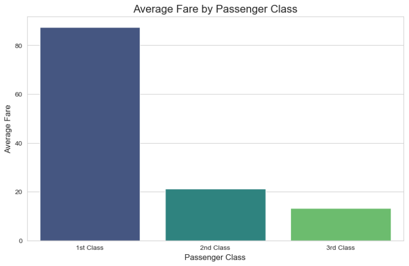
Bar Chart: Comparing Average Fare by Class
A bar chart is excellent for comparing a numerical value across different categories. Let’s see if there was a difference in the average ticket fare (fare) paid by passengers of different classes (pclass).
#Group data by passenger class and calculate the mean fare
fare_by_class = titanic_df.groupby('pclass')['fare'].mean().reset_index()
#Create the plot figure
plt.figure(figsize=(10, 6))
#Create the bar chart
sns.barplot(x='pclass', y='fare', data=fare_by_class, palette='viridis')
#Add titles and labels
plt.title('Average Fare by Passenger Class', fontsize=16)
plt.xlabel('Passenger Class', fontsize=12)
plt.ylabel('Average Fare', fontsize=12)
plt.xticks([0, 1, 2], ['1st Class', '2nd Class', '3rd Class']) # Set custom x-axis labels
#Show the plot
plt.show()
Code Explanation
titanic_df.groupby(‘pclass’)[‘fare’].mean(): We use Pandas to group our DataFrame by ‘pclass’ and then calculate the average (mean) ‘fare’ for each class.
sns.barplot(…): This Seaborn function makes creating a bar chart straightforward.
x=’pclass’, y=’fare’: We map the columns from our fare_by_class DataFrame to the x and y axes.
palette=’viridis’: We choose a predefined color scheme to make the chart visually appealing.
plt.xticks(…): Since the ‘pclass’ values are 1, 2, and 3, we use this function to set more descriptive labels for the x-axis.
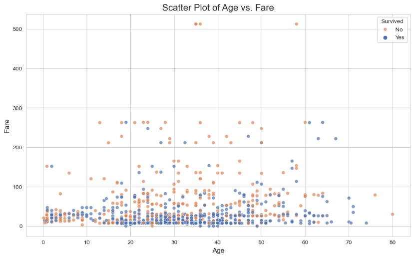
Scatter Plot: Exploring Age vs. Fare
A scatter plot is the best way to visualize the relationship between two different numerical variables. Let’s plot passenger age against ticket fare to see if there’s any correlation.
#Create the plot figure
plt.figure(figsize=(12, 7))
#Create the scatter plot using Seaborn for better aesthetics
#We use 'survived' to color the dots for an extra layer of insight
sns.scatterplot(x='age', y='fare', hue='survived', data=titanic_df, alpha=0.7, palette='deep')
#Add titles and labels
plt.title('Scatter Plot of Age vs. Fare', fontsize=16)
plt.xlabel('Age', fontsize=12)
plt.ylabel('Fare', fontsize=12)
plt.legend(title='Survived', labels=['No', 'Yes'])
#Show the plot
plt.show()
Code Explanation
- sns.scatterplot(…): We use Seaborn’s scatter plot function as it easily allows for coloring points by a third category.
- x=’age’, y=’fare’: We map our two numerical columns to the axes.
- hue=’survived’: This is a powerful feature that colours each dot based on the value in the ‘survived’ column. This helps us see if survival was related to age and fare.
- alpha=0.7: We make the points slightly transparent to better see areas where many dots overlap.
- plt.legend(…): This customizes the legend to be more descriptive, changing the labels from 0 and 1 to “No” and “Yes”
This is so beautiful. I am loving this piece of beauty. Let us now move to the make our visual more interactive and appealing with Plotly.
Creating Interactive Visualizations with Plotly
While Matplotlib is fantastic for static charts, Plotly is where your data comes to life. This library specializes in creating beautiful, interactive visualizations that allow you or your audience to explore the data by hovering, zooming, and filtering.
For this guide, we’ll use Plotly Express, a high-level part of the Plotly library. Think of it like this: Plotly Express is to Plotly what Seaborn is to Matplotlib. It gives you a simple, clean syntax to create powerful, interactive charts with very little code.
Histogram: An Interactive Look at Age Distribution
Let’s recreate our age distribution histogram. Notice how you can now hover over each bar to get exact counts. We can also easily add another layer of information by coloring the bars based on survival status.
#Create an interactive histogram with Plotly Express
#For plotly express,syntax is:
Import plotly.express as px
#Meanwhile,for plotly graph object,syntax is:
Import plotly.graph_objects as go
fig = px.histogram(titanic_df, x="age", color="survived", marginal="box", # Adds a box plot above the histogram
hover_data=titanic_df.columns, title="Interactive Age Distribution of Titanic Passengers")
#Show the plot
fig.show()
Code Explanation
- px.histogram(…): This single function creates the entire interactive chart.
- titanic_df: The first argument is always our DataFrame.
- x=”age”: We map the ‘age’ column to the x-axis.
- color=”survived”: This automatically colors the bars based on whether a passenger survived, creating a stacked bar for each age bin.
- marginal=”box”: A great feature that adds a box plot along the top margin, giving us another view of the distribution.
- fig.show(): This renders the interactive plot in your notebook. Try hovering over the bars and the box plot!
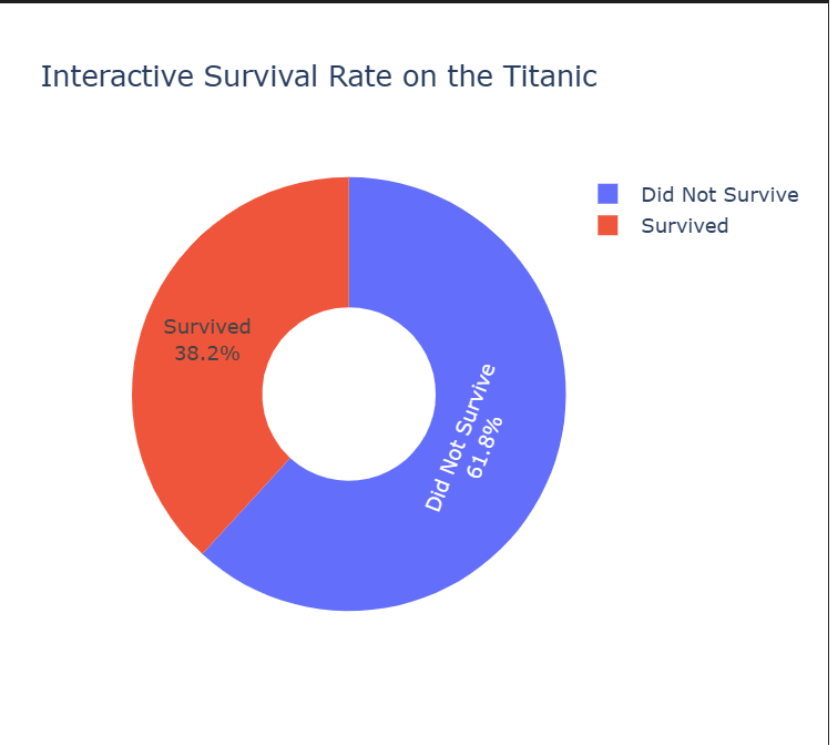
Donut Chart: Exploring Survival Proportions Interactively

Creating a donut chart in Plotly is incredibly straightforward. The hole parameter does all the work for us.
#Get the counts of survivors for the chart
survival_counts = titanic_df['survived'].value_counts()
#Create an interactive donut chart
fig = px.pie(survival_counts, values=survival_counts.values, names=['Did Not Survive', 'Survived'], title='Interactive Survival Rate on the Titanic',
             hole=0.4) # This creates the donut hole
#Update the text information
fig.update_traces(textinfo='percent+label')
#Show the plot
fig.show()
Code Explanation
- px.pie(…): The function to create pie and donut charts.
- values=survival_counts.values: We pass the actual counts (e.g., 549 and 342) as the values for the slices.
- names=[…]: We provide the labels for each slice.
- hole=0.4: This parameter instantly turns our pie chart into a donut chart by setting the size of the center hole (40% of the radius).
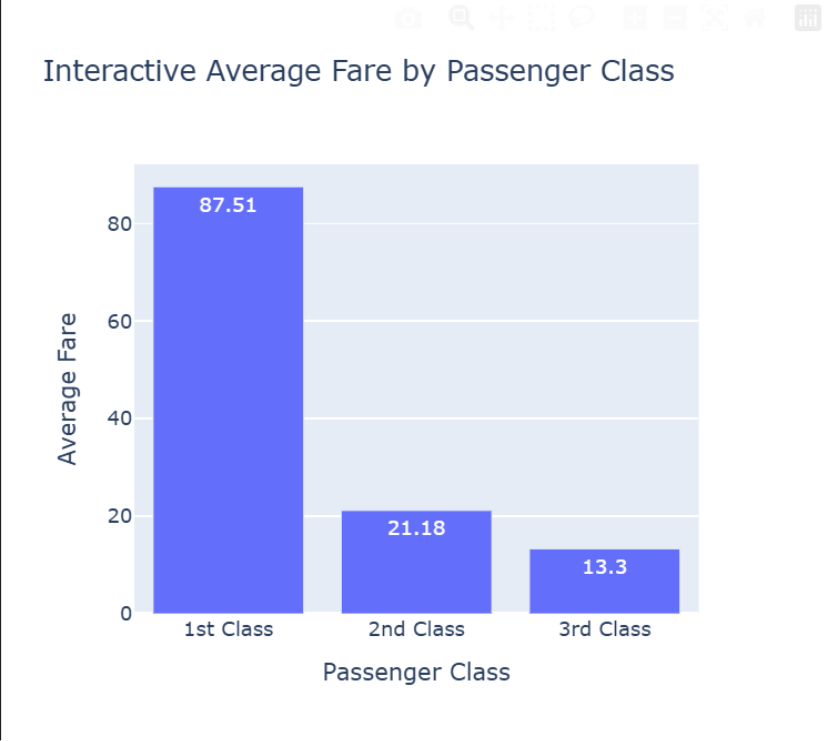
Bar Chart: Interactive Fare Comparison
Let’s revisit our bar chart comparing the average fare by class. With Plotly, we now get precise values on hover for free.
#We use the same 'fare_by_class' DataFrame created earlier
fare_by_class = titanic_df.groupby('pclass')['fare'].mean().reset_index()
#Create an interactive bar chart
fig = px.bar(fare_by_class, x='pclass', y='fare', title='Interactive Average Fare by Passenger Class', labels={'pclass': 'Passenger Class', 'fare': 'Average Fare'},
text=round(fare_by_class['fare'], 2) ) #Add text labels to bars
#Customize the x-axis labels
fig.update_xaxes(tickvals=[1, 2, 3], ticktext=['1st Class', '2nd Class', '3rd Class'])
#Show the plot
fig.show()
Code Explanation
- px.bar(…): The function for creating bar charts.
- labels={…}: This allows us to set custom, user-friendly labels for our axes directly within the function.
- text=…: This places the rounded average fare value directly on top of each bar for easy reading.
- fig.update_xaxes(…): This function gives us fine-grained control over the axes. Here, we use it to set our custom labels for each passenger class.
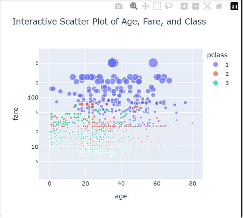
Scatter Plot: A Deeper Dive into Age, Fare, and Class
Plotly’s scatter plots are where interactivity truly shines. We can encode multiple dimensions of data (age, fare, class, survival status) into a single chart that users can explore.
# Drop rows where required column is missing
titanic_df2 = titanic_df.dropna(subset=["age", "fare", "pclass", "name"])
# Convert pclass to string for coloring
titanic_df2['pclass'] = titanic_df2['pclass'].astype(str)
#Create a rich, interactive scatter plot
fig = px.scatter(titanic_df2,
                 x="age",
                 y="fare",
                 color="pclass", # Color dots by passenger class
                 size="fare", # Make dots larger for higher fares
                 hover_name="name", # Show passenger name on hover
                 log_y=True, # Use a log scale for the y-axis to handle outliers
title="Interactive Scatter Plot of Age, Fare, and Class" )
#Show the plot
fig.show()
Code Explanation
- titanic_df2[‘pclass’] = titanic_df2[‘pclass’].astype(str): This is required to convert pclass column to string type as it is float by default
- px.scatter(…): The core function for our scatter plot.
- color=”pclass”: We map passenger class to the color of the dots.
- size=”fare”: We map the fare to the size of the dots. This makes higher-fare tickets visually pop.
- hover_name=”name”: An amazing feature that displays the passenger’s name when you hover over their corresponding data point.
- log_y=True: We use a logarithmic scale for the ‘fare’ axis because there are a few very high fares (outliers) that would otherwise squash all the other data points into the bottom of the chart.
You have done a fantastic job. Let’s go on to the final stage of this article where we will summarize and conclude.
Conclusion: Your Visualization Toolkit
You’ve now built a full suite of visualizations, moving from the static, controlled world of Matplotlib to the dynamic, interactive environment of Plotly. You didn’t just create charts; you learned how to choose the right tool for the job.
The key takeaway is simple:
- Use Matplotlib when you need perfect, publication-quality static images for reports or papers.
- Use Plotly when you want to empower your audience to explore the data for themselves in dashboards and web applications.
🚀 Next Steps
You are now equipped to turn any dataset into a compelling story. To continue your journey, try these challenges:
- Customize Your Plots: Dive into the documentation for fig.update_layout() in Plotly to change fonts, add annotations, and customize legends.
- Create a New Chart: Use the Titanic dataset to create a px.box() plot to compare the age distributions across different passenger classes.
- Use Your Own Data: Find a dataset you’re passionate about, load it into a jupyter notebook, and try to create a histogram, bar chart, and scatter plot to uncover your own unique insights.
The ability to visualize data is a superpower. By mastering both Matplotlib and Plotly, you’ve added two of the most valuable tools to your data analytics toolkit. Go build something amazing!